Transforming AW Spaces from Construction to Connection – A Brand That Truly 'Comes to Life'
BRAND STRATEGY & MARKETING STRATEGYThe challenge
AW Spaces had no clear brand strategy. Their identity was monochrome, corporate, and heavily construction-focused, lacking the warmth and personality that truly set them apart. Their marketing wasn’t reflecting what made them great—clients loved working with them because of their caring, helpful, and dynamic approach, but none of that came through in their branding.


The Approach
Brought in specifically to lead a rebrand, I worked closely with brand strategist Rose Radtke to uncover what made AW Spaces unique. Through interviews with clients, the team, and key stakeholders, we found that their true differentiator was the energy and life they injected into every space they worked on.
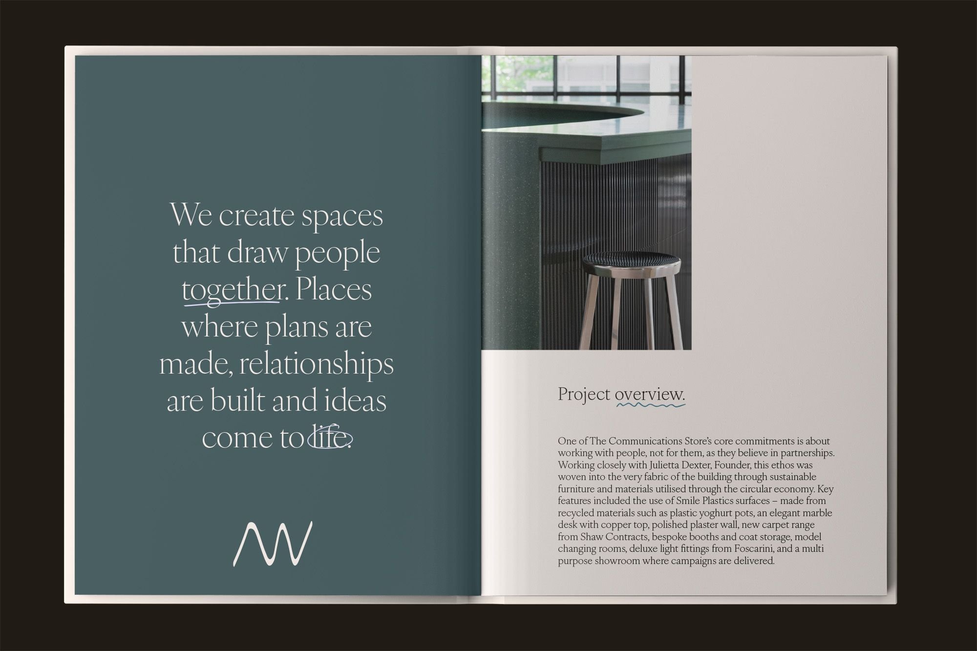
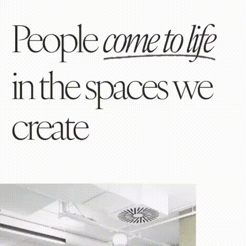
From this, we developed a new brand identity centered around the tagline "Come to Life." To bring this to life visually and strategically, I:
Introduced a fresh, sophisticated colour palette to replace the stark black-and-white branding
Commissioned new team headshots that better reflected the company’s personality
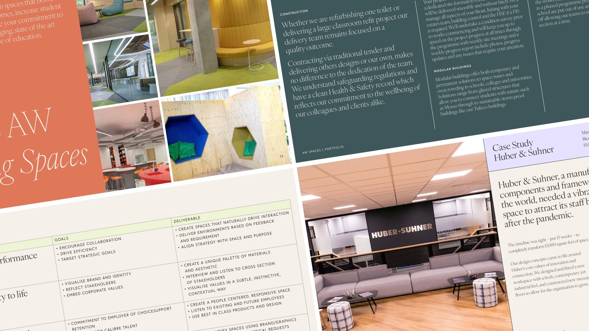
Developed a new website aligned with the refreshed brand identity
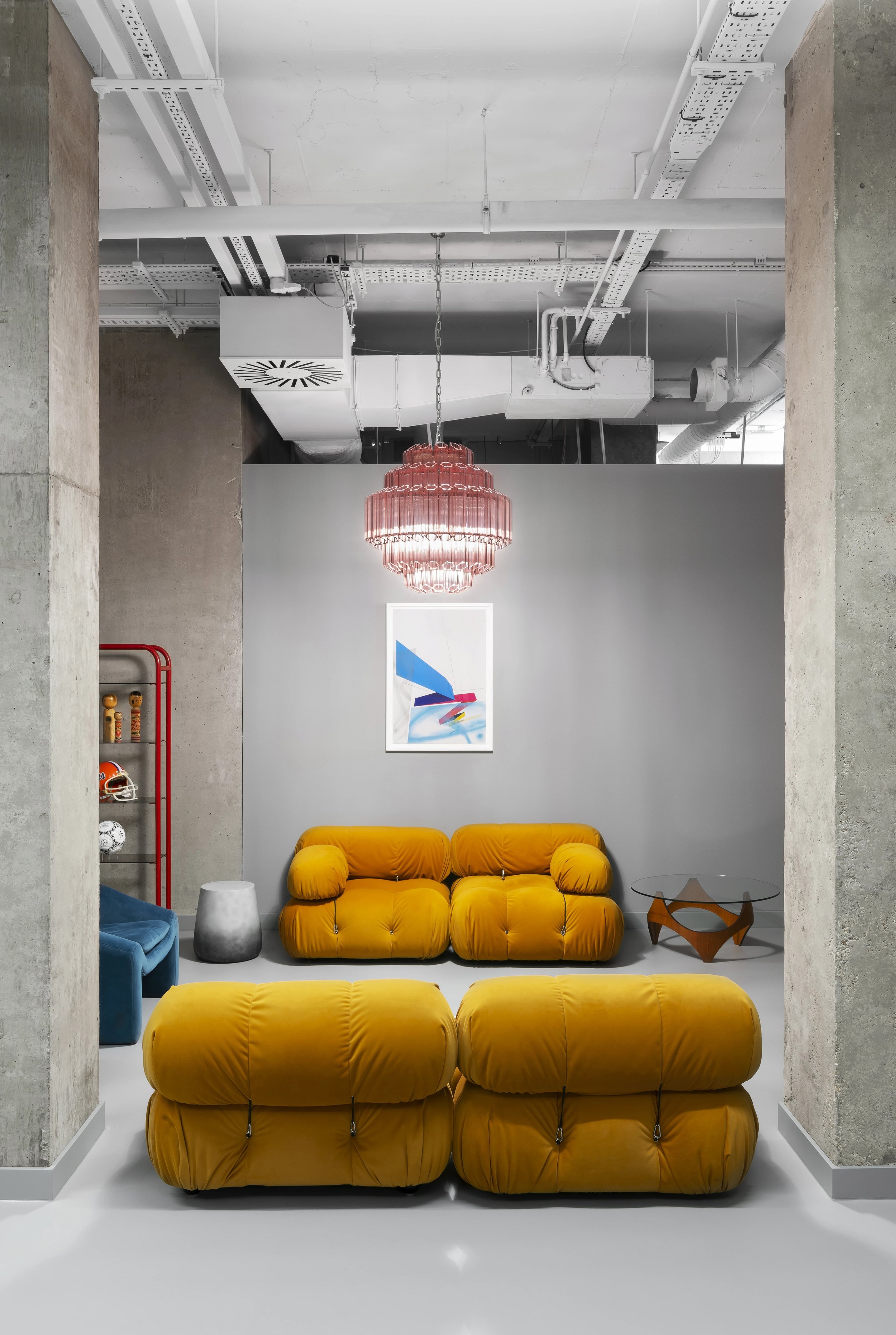
Created updated photography that showcased AW’s work in a more engaging, vibrant way
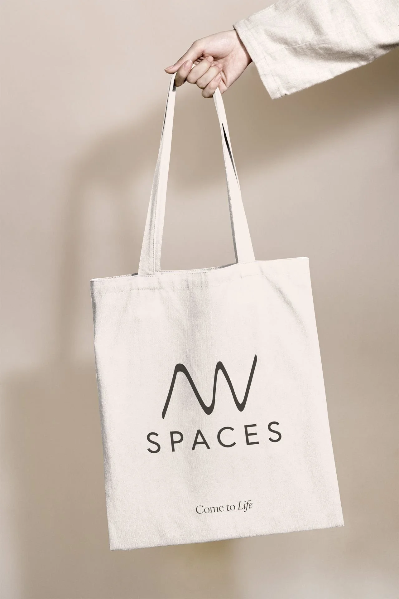
Designed branded merchandise to reinforce the new brand direction
The Result
The rebrand had a significant impact, not just on AW Spaces’ visual identity but also on their business performance. Website clicks increased by 80%, and marketing-qualified leads grew by 180%, demonstrating the power of a brand that truly reflects its values and personality.
GRAPHIC DESIGN & ART DIRECTION BY MYLES LUCAS
BRAND STRATEGY BY ROSE RADKTE